Using D3 for your projects.

I'm a full stack web developer, with main skills in React.js for frontend development and Node.js+Express and Python + Flask for backend, with MongoDB as database, also have skills in Vue.js, Fast API+Python, etc. You're welcome to review and critique any project I've done so far.
Introduction
D3.js is a javascript library for creating visualization or images in svg formats.
It's use cases are numerous from simple to complex graphs to maps and images depending on your expertise. We would focus on using D3.js to build some simple visualization chats for us. In this article we'll discuss creating a scatter plot with D3.js
Prerequisites
- A basic knowledge of Javascript
D3.js package is installed in your project.
There are two main ways this can be done:
- use of CDN link in a script tag, check here for more details.
- install with npm by
npm i d3
- We would be getting the data for the scatter plot in this article from here. You can download or fetch directly from the site.
Markup
We'll be using a simple html page, but note that you can increase the complexity as far as you go, provided errors don't occur. My markup is as follows:
<html>
    <head>
        <script src="https://cdnjs.cloudflare.com/ajax/libs/d3/5.16.0/d3.min.js"></script>
    </head>
    <body>
        <div class='let'></div>
        <script src="index.js">

        </script>
    </body>
</html>
Notice I'm using a CDN link to launch my d3, which is appropriate for a single page application with no extra route, if you're building an application that displays more than one page or involves more than one route like React applications, it is advisable to use npm packages, because for each page the user uses d3 is downloaded even when not in use, which leads to various scenarios which we'll not be talking about in this article.
Scatter Plot
Initialization
We should go to the javascript file which we already linked to html file. So I'll fetch the data from the link, but you can download and load it.
let url='https://raw.githubusercontent.com/freeCodeCamp/ProjectReferenceData/master/cyclist-data.json'
fetch(url).then(res=>res.json()).then(json=>{
    let padding=50;
    let w=950;
    let h=800;
})
After fetching, I defined some data we'll be using like the width and height of the svg and the padding we'll be giving the graph.
Preparation and scaling
After this we move further;
let year=json.map((i)=>{
    return i.Year
 })

let time=json.map((i)=>{
    var d=d3.timeParse("%M:%S");
    let arr=d(i.Time)
    return arr
 })

 let k=d3.timeFormat('%M:%S')

 let xScale=d3.scaleLinear().domain([d3.min(year)-1,d3.max(year)+1]).range([padding, w - padding]);
 let yScale=d3.scaleTime().domain(d3.extent(time)).range([padding,h-padding]);
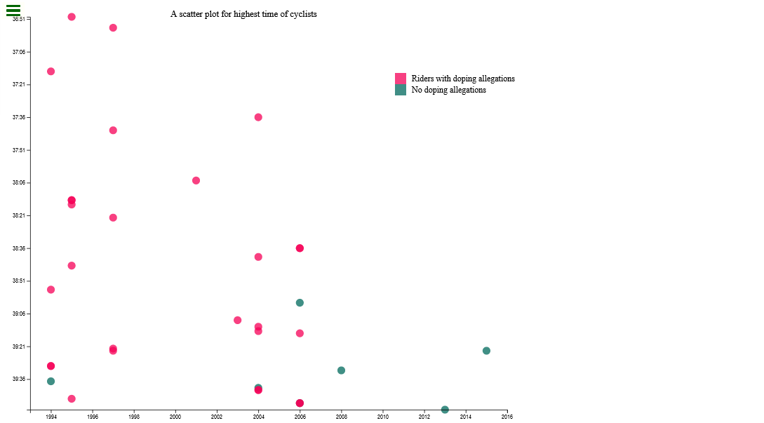
We have to have seen the json file to know the data we need to extract from it to get what we want. This file is a compilation of fastest cyclist and the year, including those with doping allegations.
We'll need the year as one axis and the times clocked during cycling as another axis, we can also represent the allegations or not by colors which is exactly what we're going to do. So we map the json and return year and redo the mapping returning time with a time format of minutes:seconds using d3.timeParse.
When we're defining the x and y axis scale, we most times choose from d3 numerous scales available, you can check here for various scales available in D3. We also need to add domain which is minimum and maximum values that will be represented in the axes. We also have range which is optional but is used to specify the distance that will be covered by the graph, the default is everything is covered, but we gave our graph a padding of 50 at all sides.
Axes and Svgs
let xAxis=d3.axisBottom(xScale).tickFormat(d3.format('d'));
let yAxis=d3.axisLeft(yScale).tickFormat(k);
let tool=d3.select('.let').append('div').attr('id','tooltip')
let svg=d3.select('.let').append('svg').attr('width',w).attr('height',h).attr('class','scatter');

svg.append('text').text('A scatter plot for highest time of cyclists').attr('id','title').attr('x',(w-padding)/3).attr('y',padding);
So after creating a scale for both x and y axis, we create the axis. For x axis we want the axis at the bottom, so we use d3.axisBottom, for the tick format we use 'd' which is simply number strings. For y axis we put our axis at the left then we use the format we defined earlier with d3.timeFormat and assigned to k.
We want to create a tooltip which we'll attach to every dot, so that when you hover over a dot, you see more info about that dot, like the name of the rider, country, and more. So we get the .let div and append a div that'll show the details.
Lastly, we create the svg by selecting the .let div we have in our markup, then append a svg to it with attributes we defined earlier.
Now the svg we append, we give it a title by appending a text with appropriate title and postioning it with the x and y parameters.
Dots with titles
  svg.selectAll('.dot').data(json).enter().append('circle')
    .attr('cx', (d,i)=>xScale(year[i]))
    .attr('cy',(d,i)=>yScale(time[i]))
    .attr('r',7).attr('fill',(d)=>{
        if(d.Doping===''){
            return '#00695C'
        }
        else{
            return '#F50057'
        }
    }).style('opacity','0.75').attr('class','dot').attr('data-xvalue',(d,i)=>year[i]).attr('data-yvalue',(d,i)=>time[i].toISOString())

    .on('mouseover',(d,i)=>{
        tool.style('display','inline-block')
            .attr('data-year',year[i])
            .style('background-color','#B2DFDB')
            .style('color','black')
            .style('opacity',1)
            .html(d.Name+' from '+d.Nationality+' country in the Year: '+d.Year+', and clocked time- '+d.Time+'.  Allegations: '+d.Doping)
    })
    .on('mouseout',(d)=>{
        tool.style('display','inline-block')
            .style('opacity',0)
            .html()
    })
    //console.log(json)
    d3.select('.let').selectAll('circle').data(json).append('title').text((d)=>d.Name+' from '+d.Nationality+'\nYear: '+d.Year+', Time: '+d.Time+'\n'+d.Doping).style('fill','#B2DFDB')
Now we create the dots proper, by get the data with data(json) and then enter() to iterate through all the data which is compulsory, for each item in the json we append a circle to the svg and give it properties and positioning and also give it an attribute of fill, which iterates through all the items in json and check if doping allegation is available, if yes a particular color fill is assigned, if no another color fill is assigned to it.
We also check the event of mouse over and mouse out to display the tooltip we built earlier, on mouse over we infuse the tooltip with the data to be displayed and mouse out clears it. A title is also appended to each dot to show more details too, these titles are shown when we hover over a dot, so we see a tooltip and a tile when we hover over a dot. It is not necessary to do both, one of either is enough but just to
Legends 🤝 Transforms
    let legend=['pink','green']
    svg.selectAll('rect').data(legend).enter().append('rect').attr('x',700).attr('y',(d,i)=>150+(i*20)).attr('height',20).attr('width',20).style('fill',(d)=>{
        if(d=='pink'){
            return '#F50057'
        }
        else{
            return '#00695C'
        }
    }).attr('opacity','0.75').attr('id','legend').append('title').text((d)=>{
        if(d=='green'){
            return 'No doping allegations'
        }
        else{
            return 'Riders with doping allegations'
        }
    })
    svg.append('text').text('Riders with doping allegations').attr('x',730).attr('y',165).style('font-size','15px')
    svg.append('text').text('No doping allegations').attr('x',730).attr('y',185).style('font-size','15px')
    svg.append('g').attr('transform','translate(0,'+(h-padding)+')').attr('id','x-axis').call(xAxis);
    svg.append('g').attr('transform','translate('+(padding)+',0)').attr('id','y-axis').call(yAxis);
So we create a legend that explains the colors meanings.
The we create a transform for both x and y axis then call the axis to the transform, so as to tanslate the axis from 0 to the needed length, considering the padding we want to have.
It should look like this:
Many more things can be done with D3.js especially 2D drawings, happy coding!

